CSS Navigation Bar
A navigation bar consists of links that connect different sections of a website, providing a cohesive browsing experience. It is commonly displayed at the top of a page and can be oriented horizontally, vertically, or in a fixed position.
To ensure accessibility, the navigation bar should be placed before other sections on the webpage.
When it comes to styling navigation bars, you have various options to customize their appearance. Here are a few common techniques:
-
Background and Text Styling:
- Set the background color, gradient, or image for the navigation bar using the
backgroundproperty. - Adjust the text color, font size, and font family using the
color,font-size, andfont-familyproperties, respectively. - Add padding and margins to create spacing between navigation items using the
paddingandmarginproperties.
- Set the background color, gradient, or image for the navigation bar using the
-
Layout and Positioning:
- Choose between a horizontal or vertical layout using either
display: inlineordisplay: blockfor the navigation items. - Use the
floatproperty to align items next to each other horizontally. - To create a fixed navigation bar that remains visible while scrolling, use
position: fixed.
- Choose between a horizontal or vertical layout using either
-
Effects and Interactions:
- Apply hover effects by using the
:hoverselector to change background colors, text colors, or add transitions. - Add transitions or animations to create smooth visual effects during interactions.
- Use pseudo-classes like
:activeor:focusto style navigation items when they are clicked or in focus.
- Apply hover effects by using the
-
Dropdown Menus:
- Create dropdown menus by nesting additional
<ul>elements within specific navigation items. - Hide the nested
<ul>by default (display: none) and display it when the parent navigation item is hovered or clicked (display: blockordisplay: flex). - Apply styling to the dropdown menu items using separate CSS rules.
- Create dropdown menus by nesting additional
Navigation bars can be styled into many types using CSS. Here are a few basic examples using positioning,
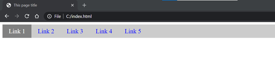
Horizontal Navigation Bar
The horizontal navigation bar is the horizontal list of links, which is generally on the top of the page.
Above example helps in showcasing the use of an 'ul' list to make a navigation bar. We are adding the overflow: hidden property that prevents the li elements from going outside of the list, display: block property displays the links as the block elements and makes the entire link area clickable.
We are also adding the float: left property, which uses float for getting the block elements to slide next to each other.
If we want the full-width background color then we have to add the background-color property to <ul> rather than the <a> element.
Input:-
Output:-
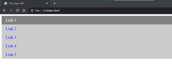
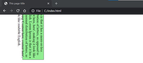
Vertical Navigation Bar
In vertical navigation bar, we will arrange the navbar links in vertical form.
Input:-
Output:-
Fixed Navigation Bar
This is a navigation bar that is fixed on the top and when scroll up or down, it will be visible.
Input:-
Output:-
Sticky Navigation Bar
The position: sticky; property is used to position the element based on the scroll position of the user.
This CSS property allows the elements to stick when the scroll reaches to a certain point. Depending upon the scroll position, a sticky element toggles between fixed and relative properties.
Input:-
Output:-
Dropdown Navigation Bar
This dropdown navigation bar consists of dropdowns on hover. We can manipulate these dropdowns according to requirement.
Input:-
Output:-
