
Tailwind Crash Course - Project Based Learning
Display Modes
In css, you may notice that mostly things are in blocks. But sometimes you need to change that from block to inline and most of the time to flex or even hidden.
Let’s take a look at the available display modes:
| Display Modes | |
| block inline inline-block flex inline-flex table table-row table-cell hidden |
No widths |
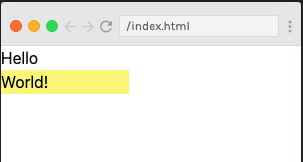
Real time example:
<!--sample code to use different display modes-->
<div>Hello <div class="bg-yellow-300 w-32 h-6">World!</div></div>
Result will be something like:
After adding .inline :
<!--sample code to use different display modes-->
<div>Hello <div class="bg-yellow-300 w-32 h-6 inline">World!</div></div>
The result will be:
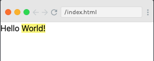
Now, if you have noticed in the result after adding .inline, our second <div> with yellow background has lost respective width which is mentioned .w-32. To resolve that, we have another mode which is .inline-block.
<!--sample code to use different display modes-->
<div>Hello <div class="bg-yellow-300 w-32 h-6 Inline-block">World!</div></div>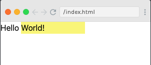
.flex mode
A very very and very important part in Tailwind.
.hidden mode
This is an important mode and is used to hide an element.
<!--sample code to use different display modes-->
<div>Hello <div class="bg-yellow-300 w-32 h-6 hidden">World!</div></div>
You can notice in the result, that World! with yellow background is gone.

