
How To Build A School Landing Page Using Only Html And CSS
About Section
After we are done with the heading page, the next thing would be to build our about section. A section is another part of the web page in this context, this is what you will see when scrolling down the web page.
So, we will create a section with a class name of main and a div with a class name of container. We are going to add the icons and also style the text as well.
<!--first section-->
<section class="main">
<div id="about" class="container">
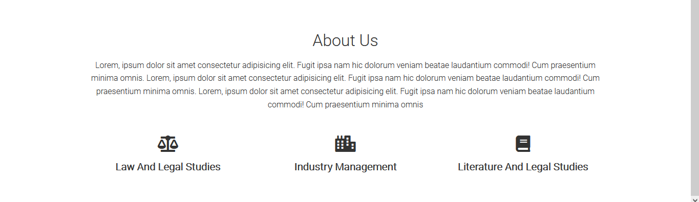
<h2 class="font2 center-text mar1">About Us</h2>
<p class="center-text">
Lorem, ipsum dolor sit amet consectetur adipisicing elit. Fugit ipsa nam hic dolorum veniam beatae laudantium commodi! Cum praesentium minima omnis. Lorem, ipsum dolor sit amet consectetur adipisicing elit. Fugit ipsa nam hic dolorum veniam beatae laudantium commodi! Cum praesentium minima omnis. Lorem, ipsum dolor sit amet consectetur adipisicing elit. Fugit ipsa nam hic dolorum veniam beatae laudantium commodi! Cum praesentium minima omnis
</p>
<div class="grid grid-3 center-text mar4">
<div>
<i class="fas fa-balance-scale fa-2x"></i>
<p>Law And Legal Studies</p>
</div>
<div>
<i class="fas fa-city fa-2x"></i>
<p>Industry Management</p>
</div>
<div>
<i class="fas fa-book fa-2x"></i>
<p>Literature And Legal Studies</p>
</div>
</div>
</div>
</section>
<!--end of first section-->When we save and refresh our page, we will see the html added to it.

After adding the html, you will notice there is some styling in it already. This is a result of our general styling. We added .fa-2x in the icons so we can increase its size by two. But we need to style the text as the white colour from the heading is overshadowing it.
Add this to the styling:
.main {
    padding-top: 100px;
}

.main-heading {
    max-width: 500px;
    margin: auto;
}

.main .grid h3 {
    font-size: 35px;
}

.main .grid p {
    font-size: 20px;
    font-weight: bold;
}
Now, that the text is properly styled, let’s move to the next section.
Building the second section:
In this section, we are going to use a grid to position the image and the two div cards.
Add these to your html:
<!--second section-->
    <section class="second">
        <div class="container grid">
            <img src="images/work5.jpg" />
            <div class="card">
                <h3>Your success is our priority!</h3>
                <p>Lorem, ipsum dolor sit amet consectetur adipisicing elit pandnto juse khosa.</p>
            </div>
            <div class="card">
                <h3>Your success is our priority!</h3>
                <p>Lorem, ipsum dolor sit amet consectetur adipisicing elit pandnto juse khosa.</p>
            </div>
        </div>
    </section>
    <!--end of second section-->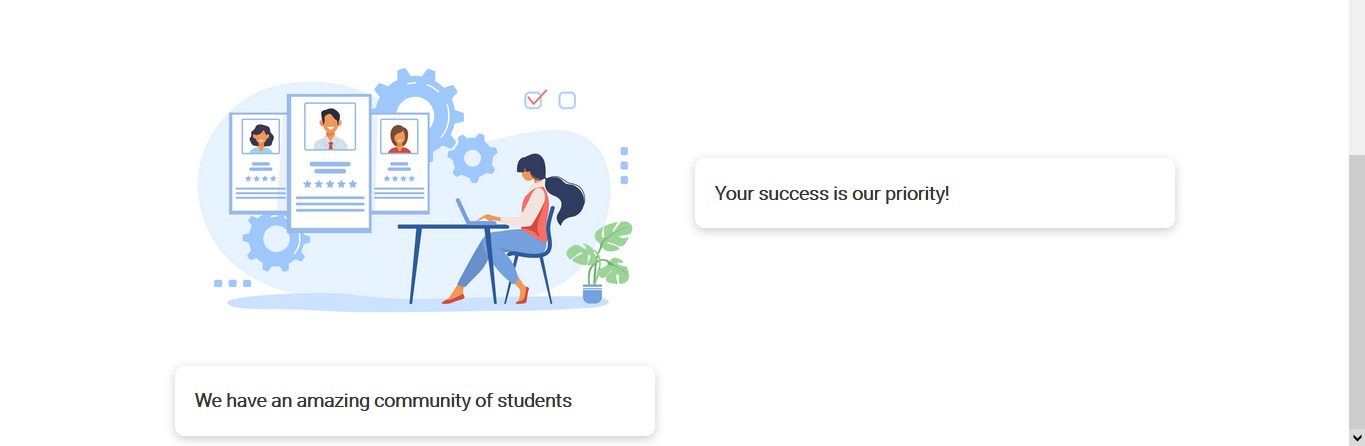
When we add the html, due to the general styling that was added initially, we can see the image and the cards are positioned due to the grid.
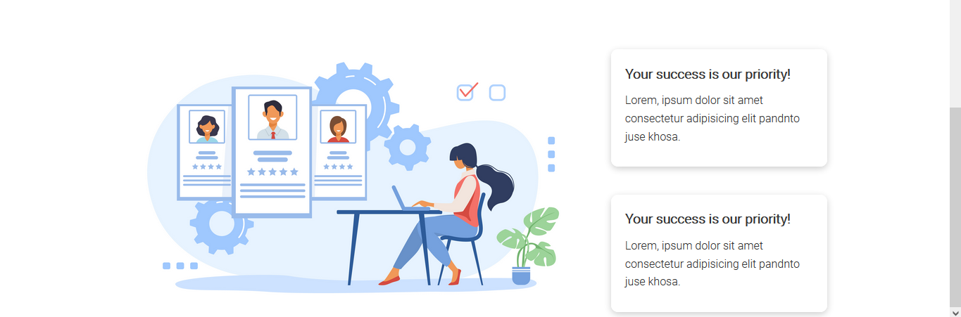
/* second section */
.second .grid {
    grid-template-columns: repeat(3, 1fr);
    grid-template-rows: repeat(2, 1fr);
}

.second .grid > *:first-child {
    grid-column: 1 / span 2;
    grid-row: 1 / span 2;
}
We gave the image and the cards a grid of repeat(3, 1fr) column and repeat(2, 1fr) rows so the image occupies one part while the cards occupy the other part.
To make the image occupy all of its space, we will give it a grid-column of 1/ span 2 and grid-row of 1/ span 2 so the image will occupy all of the space in the area while the div cards occupy the other space.
Now, after it has been styled, we will move on to the next section.
