
How To Build A School Landing Page Using Only Html And CSS
Navigation & Banner Section
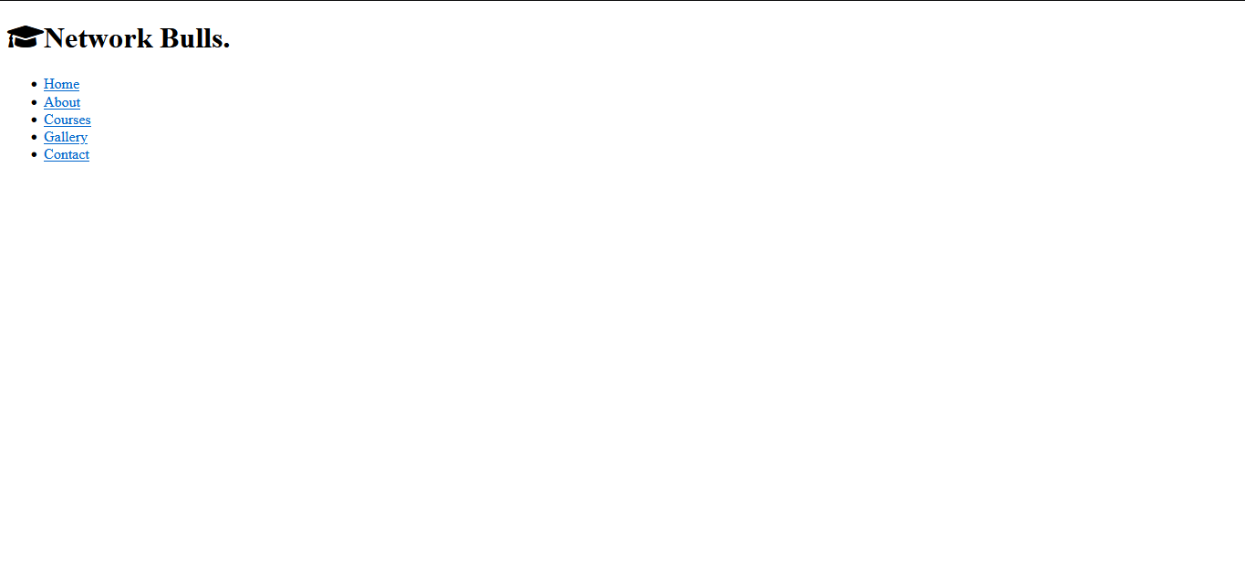
First, we will create a div with a class name of .nav. This is what will cover the nav contents of our landing page, including the logo and other links.
Create another div with a class name of container and flex inside the container, and create an h1 with a class name of logo and the text with it.
For the other links, we will create a nav element with an unordered list to show the links.
<!--Creating a nav first-->
    <div class="nav">
        <div class="container flex">
            <h1 class="logo"><i class="fas fa-graduation-cap"></i>Network Bulls.</h1>
            <!--Creating a nav element-->
            <nav>
                <ul>
                    <li><a href="#home">Home</a></li>
                    <li><a href="#about">About</a></li>
                    <li><a href="#courses">Courses</a></li>
                    <li><a href="#gallery">Gallery</a></li>
                    <li><a href="#contact">Contact</a></li>
                </ul>
            </nav>
        </div>
    </div>
<!--End of the nav-->
When we refresh our page, we will see the nav displayed as a simple text. Next, is to write out the heading.
Then for the heading:
We will create another div with a class .heading. This is what will house our header structure of the web page.
Then, we will create a div with a class .container and .grid. Because we are going to apply a grid to the elements. We will create another div with a class .heading-text for the text on the heading including the button which we will give a class .btn and .btn-outline.
We will create a div for our advert, which we will give a class .heading-card and .card which will be the end of our heading.
    <!--Creating the heading-->
    <section class="heading">

        <!--using a grid-->
        <div class="container grid">
            <div class="heading-text">
                <h1>The best University Courses for a better world</h1>
                <p>Thousands of students are already studying in Edualo University for all ages!.
                    Thousands of students are already studying in Edualo University for all ages! Join Us Today!
                </p>
                <a href="#" class="btn btn-outline">Discover More</a>
            </div>
            <div class="heading-card card">
                <h2>FIRST TIMERS DISCOUNT !!!</h2>
                <p><span class="spanned">-20%</span> FOR THE FIRST 100 STUDENTS TO REGISTER</p>
                <em>Hurry while offer lasts!</em>
                <p><a href="#contact" class="btn">Register Today</a></p>
            </div>
        </div>
    </section>
    <!--end of the heading-->
The next thing would be to style the nav and the heading, but we would need to have a general styling.
-
First, we will use a font called Roboto, so we are going to import the font from Google. By importing it, we are simply adding a link which we will copy from the Google fonts website.
-
Next, we will set general styling for the body of our webpage. We will include the font family, where we will add the Roboto we imported, whenever we refresh the page. Roboto fonts will appear.
-
Then we will set general styling to format the
box-sizing, and set themarginandpaddingto zero. -
Set some styling for the ul and the a element and remove the decorations on them.
-
Set some styling for the
h1,h2, andpelements and the image. -
And we are going to add another styling that we will use throughout the design of the webpage.
In the general styling:
-
We will give the
bodyelement aline-heightof1.6, this will cause the text to space out and not be too compacted. -
We will give the Image a
widthof100%. This will cause it to occupy the entire space of itscontainer(image). -
We will create a class
.center-textso we can easily centre a text when we want to. -
Create class names for our margins, fonts and paddings so we can use them when we want.
-
We will create class names for flex and grid, which we will reuse throughout the page.
Add these lines of code:
/* To import google fonts */
@import url('https://fonts.googleapis.com/css2?family=Roboto:wght@300&display=swap');

* {
    box-sizing: border-box;
    padding: 0;
    margin: 0;
}

body {
    font-family: 'Roboto', sans-serif;
    color: #333;
    line-height: 1.6;
}

ul {
    list-style-type: none;
}

a {
    text-decoration: none;
    color: #333;
}

h1, h2 {
  font-weight: 300;
  line-height: 1.2;
  margin: 10px 0;
}

p {
  margin: 10px 0;
}

img {
    width: 100%;
    height: 100%;
}

.center-text {
    text-align: center;
}

.bg-primary a,
  .btn-primary a,
  .bg-dark a,
  .btn-dark a {
    color: #fff;
}

.text-secondary {
    color: #1c3fa8;
}

/* formatting margins */
.mar1 {
    margin: 1rem 0;
}

.mar2 {
    margin: 1.5rem 0;
}

.mar3 {
    margin: 2rem 0;
}

.mar4 {
    margin: 3rem 0;
}

/* formatting padding */
.pad1 {
    padding: 1rem 0;
}

.pad2 {
    padding: 1.5rem 0;
}

.pad3 {
    padding: 2rem 0;
}

.pad4 {
    padding: 3rem 0;
}

.pad5 {
    padding: 4rem 0;
}

/* formatting fonts */
.font {
    font-size: 20px;
}

.font1 {
    font-size: 1rem;
}

.font2 {
    font-size: 2rem;
}

.font3 {
    font-size: 3rem;
}

/* styling the container */
.container {
    max-width: 1100px;
    margin: 0 auto;
    overflow: auto;
    padding: 0 40px;
  }

.card {
    background-color: #fff;
    color: #333;
    border-radius: 10px;
    box-shadow: 0 3px 10px rgba(0, 0, 0, 0.2);
    padding: 20px;
    margin: 10px;
}

/* the button */
.btn {
    display: inline-block;
    padding: 10px 30px;
    cursor: pointer;
    background: #d7442e;
    color: #fff;
    border: none;
    border-radius: 5px;
}

.btn-outline {
    background-color: transparent;
    border: 1px #fff solid;
}

.btn:hover {
    transform: scale(0.98);
}

.flex {
    display: flex;
    justify-content: center;
    align-items: center;
    height: 100%;
}

.grid {
    display: grid;
    grid-template-columns: repeat(2, 1fr);
    gap: 20px;
    justify-content: center;
    align-items: center;
    height: 100%;
}

.grid-3 {
    grid-template-columns: repeat(3, 1fr);
}
When we refresh the page, we will see some styling on the page.

Now, let’s style the nav. In the picture above, the nav has a red background so we are going to style the nav and give it a height of 70px. Let’s add the proper styling.
/* styling the nav */
.nav {
    background-color: #d7442e;
    color: #fff;
    height: 70px;
}
With that, the nav has a red background and with the height we added in it.

Now, let’s add some styling to the links on the nav.
We have added some colours to the links and caused them to space out using the justify-content.
/* styling the a tags */
.nav ul {
    display: flex;
}

.nav a {
    color: #fff;
    padding: 10px;
    margin: 0 5px;
}

.nav a:hover {
    border-bottom: 2px #fff solid;
}

.nav .flex {
    justify-content: space-between;
}
/* end of nav */
We will also add some styling to the links on the a element so that when we hover we get a borderline that shows up.

After styling the nav, we will move on to the heading part of the page, which is the landing page area.
Add these to your css:
/* styling the heading */
.heading {
    height: 400px;
    background-color: #d7442e;
    color: #fff;
    position: relative;
}

.heading h1 {
    font-size: 40px;
}

.heading p {
    margin: 20px 0;
}

.heading .grid {
    overflow: visible;
    grid-template-columns: 55% auto;
    gap: 30px;
}
We used a grid to set the card and the text apart. We will style the heading, the h1 and p, and add a grid to it as well.
Now, we will see what it looks like:

The heading is in a block format now but we want to make the advert sit at the bottom of the heading container and make the heading container slanted. To do that, we are going to use pseudo-elements.
We will style the .heading-card that we have. And position it relatively, when we position the card relatively and set the top, left, bottom and right, it will be set away from its normal position.
.heading-card {
    position: relative;
    top: 60px;
    height: 350px;
    width: 400px;
    padding: 40px;
    z-index: 100;
    justify-self: flex-end;
}

.heading-card .spanned {
    font-weight: 600;
    font-size: 40px;
}
As we can see, the card has left its normal position.
To edit the heading bottom, we can use what we call pseudo-elements in this case. This will make the heading bottom to be slanted whenever the page loads.
Add this to your css:
.heading::before,
.heading::after {
    content: '';
    position: absolute;
    height: 100px;
    bottom: -70px;
    right: 0;
    left: 0;
    background: #fff;
    transform: skewY(-3deg);
    -webkit-transform: skewY(-3deg);
    -moz-transform: skewY(-3deg);
    -ms-transform: skewY(-3deg);
}
After adding it, we can see that it has changed. When we use pseudo-elements in background colours, we can set the styling to not use the traditional block format.

To illustrate further on this, we will change the background colour from white to black and give it a heading bottom of 70px instead.
Remove the last lines on pseudo-elements and add this.
.heading::before,
.heading::after {
    content: '';
    position: absolute;
    height: 100px;
    bottom: 70px;
    right: 0;
    left: 0;
    background: #333;
    transform: skewY(-3deg);
    -webkit-transform: skewY(-3deg);
    -moz-transform: skewY(-3deg);
    -ms-transform: skewY(-3deg);
}
If you did that, then you should see this

This is what we are using pseudo-elements to do here, using the transform property, we can create a slanted line and place it at the bottom of our heading so it appears slanted when looking at it. But, in this case, it is a black background and higher than the heading bottom. But to keep it properly positioned, add the previous css
.heading::before,
.heading::after {
    content: '';
    position: absolute;
    height: 100px;
    bottom: -70px;
    right: 0;
    left: 0;
    background: #fff;
    transform: skewY(-3deg);
    -webkit-transform: skewY(-3deg);
    -moz-transform: skewY(-3deg);
    -ms-transform: skewY(-3deg);
}
If you have done that, then you should be seeing this.

You can check this for more information on css pseudo-elements.
And with that our nav and the entire heading is done and looking good.
